
Chart Widget
The chart widget allows you to visualize data in a variety of ways. The widget supports a wide range of chart types, including line, bar, pie, and scatter charts.
How to use
- add a graph widget to a dashboard
- select one of the charting options as render option
- select the graph database
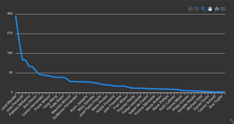
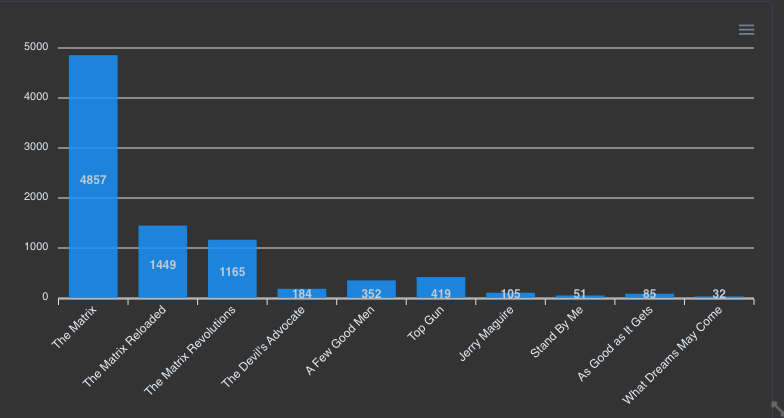
- write a (Cypher) query returning at least a 'y' column and optionally an 'x' column. The 'y' column will be used as the value for the chart and the 'x' column will be used as the label for the chart. If no 'x' column is provided, the chart will use the row number as the label.
Important
The query should return at least a 'y' column and optionally an 'x' column.
If your data is not called 'x' or 'y' you can, of course, use an alias like so:
cypher
MATCH (n:Person) return n.age as x, count(n) as yThis would create a (histogram) chart with the age on the x-axis and the count of people with that age on the y-axis.
The charts are based on the Apexcharts library. You can find the documentation here.